
As a Data Scientist at Precision Analytics, I have had the good fortune to meld my background in epidemiology and biology with …
Implementation of a decision tree analysis
In this second installment of our three-part series on decision tree modelling, we’ll jump right into some analysis using R software . If you aren’t familiar with decision trees, part 1 of our series provides an introduction to decision tree theory including many of the concepts used in our analysis.
A number of R packages exist that provide functions useful for decision tree analysis such as tree
, rpart
, and C5.0
. However, we’ll be employing the tidymodels
ensemble of packages.
- Inspect the data and do some cleaning
- Split the data into training and test sets
- Define a model
- Fit the model to the training data
- Tune some hyperparameters
- Select the best hyperparameter values and finalize the model
- Test and review the final model
- Examine model performance
We are using R version 4.1.2 with RStudio 1.4.1.
Note that tidymodels imports a number of packages including dplyr and ggplot2 which will also be used in our analyses.
library(stringr)
library(tidymodels)
library(probably)
library(rpart.plot)
library(doParallel)
library(vip)
For this analysis we’ll be using a stroke dataset downloadable from Kaggle with data on 5110 patients and 12 variables.
A call to str() will show us the structure of the dataset. The outcome, stroke, is a binary categorical variable and we can see that most of the predictors are also categorical except for age, bmi, and avg_glucose_level which are continuous. However, the column formats are not always consistent with the predictor types. Most notably, bmi, which should be numeric, is a character variable with “N/A” mixed with the values.
stroke <- read.csv("healthcare-dataset-stroke-data.csv")
str(stroke)
## 'data.frame':	5110 obs. of  12 variables:
## $ id               : int  9046 51676 31112 60182 1665 56669 53882 10434 27419 60491 ...
## $ gender           : chr  "Male" "Female" "Male" "Female" ...
## $ age              : num  67 61 80 49 79 81 74 69 59 78 ...
## $ hypertension     : int  0 0 0 0 1 0 1 0 0 0 ...
## $ heart_disease    : int  1 0 1 0 0 0 1 0 0 0 ...
## $ ever_married     : chr  "Yes" "Yes" "Yes" "Yes" ...
## $ work_type        : chr  "Private" "Self-employed" "Private" "Private" ...
## $ Residence_type   : chr  "Urban" "Rural" "Rural" "Urban" ...
## $ avg_glucose_level: num  229 202 106 171 174 ...
## $ bmi              : chr  "36.6" "N/A" "32.5" "34.4" ...
## $ smoking_status   : chr  "formerly smoked" "never smoked" "never smoked" "smokes" ...
## $ stroke           : int  1 1 1 1 1 1 1 1 1 1 ...
A temporary conversion of categorical variables to factor format and a call to summary shows us the levels of these predictors.
select(stroke,
  gender,
  hypertension,
  heart_disease,
  ever_married,
  work_type,
  Residence_type,
  smoking_status
) %>%
  mutate(across(everything(), factor)) %>%
  summary()
##     gender     hypertension heart_disease ever_married         work_type
##  Female:2994   0:4612       0:4834        No :1757     children     : 687
##  Male  :2115   1: 498       1: 276        Yes:3353     Govt_job     : 657
##  Other :   1                                           Never_worked :  22
##                                                        Private      :2925
##                                                        Self-employed: 819
##  Residence_type         smoking_status
##  Rural:2514     formerly smoked: 885
##  Urban:2596     never smoked   :1892
##                 smokes         : 789
##                 Unknown        :1544
Notice the “Unknown” category in smoking_status. In general, replacing missing values with an additional category is not recommended (PDF, 2.7 MB)
as grouping together observations missing on some variable will lead to bias
if the missingness is correlated to the outcome or any other predictor.
Roughly 30% of patients in our data set are missing a value for smoking_status. Quickly plotting age by smoking status shows a large spike in proportion of patients with unknown smoking status in the youngest age range.
pa_pal <- colorRampPalette(c("#A30664", "#E6B8D4", "#C6A1D1", "#A085CE", "#9FBBFC"))

n_smoking_levels <- length(unique(stroke$smoking_status))

ggplot(stroke, aes(x = age, colour = smoking_status)) +
  geom_density() +
  scale_colour_manual(values = pa_pal(n_smoking_levels)) +
  theme_minimal()
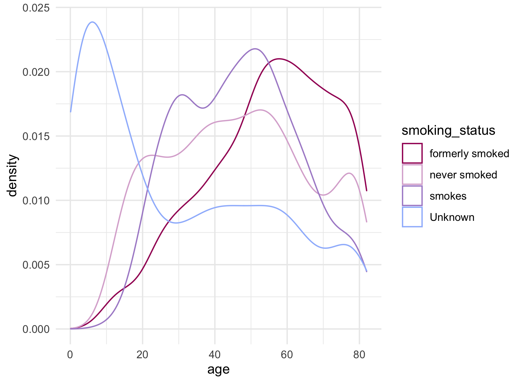
As many modelling methods drop missing values, the desire to retain such a large number of observations is understandable. Alternatives to missing categories include forms of imputation.
Fortunately, decision trees can handle missing predictor values through the use of surrogate predictors so for the purposes of this analysis, we can convert the “Unknown” category to missing without further adjustment.
For consistency in categorical values, we will remove underscores, capitalize just the first word, and convert all categorical predictors and the outcome variable to factors. Without the awkward “Unknown” category, smoking_status now makes sense as an ordered factor
. We will also convert bmi to a numeric variable and shorten the name avg_glucose_level to avg_glucose.
stroke_clean <- rename_with(stroke, tolower) %>%
  rename(avg_glucose = avg_glucose_level) %>%
  mutate(
    across(c(work_type, smoking_status), ~ str_to_sentence(gsub("_", " ", .x))),
    across(c(gender, ever_married, work_type, residence_type), factor),
    across(c(hypertension, heart_disease), factor, labels = c("No", "Yes")),
    smoking_status = factor(
      x = na_if(smoking_status, "Unknown"),
      levels = c("Never smoked", "Formerly smoked", "Smokes"),
      ordered = TRUE
    ),
    stroke = factor(stroke, levels = c(1, 0), labels = c("Stroke", "No stroke")),
    bmi = as.numeric(ifelse(bmi == "N/A", NA, bmi))
  )
Taking a look at our outcome variable, there appears to be a strong class imbalance - with roughly 5% of patients having had a stroke and 95% no stroke - which can lead to poor prediction in the underrepresented class. Advanced methods exist for dealing with this type of problem, for example up- or down-sampling of the training data; however, in this analysis we are focusing on the steps to implementing a decision tree so we will leave this issue for now.
summary(stroke_clean)
##        id           gender          age        hypertension heart_disease
##  Min.   :   67   Female:2994   Min.   : 0.08   No :4612     No :4834
##  1st Qu.:17741   Male  :2115   1st Qu.:25.00   Yes: 498     Yes: 276
##  Median :36932   Other :   1   Median :45.00
##  Mean   :36518                 Mean   :43.23
##  3rd Qu.:54682                 3rd Qu.:61.00
##  Max.   :72940                 Max.   :82.00
##
##  ever_married         work_type    residence_type avg_glucose_level
##  No :1757     Children     : 687   Rural:2514     Min.   : 55.12
##  Yes:3353     Govt job     : 657   Urban:2596     1st Qu.: 77.25
##               Never worked :  22                  Median : 91.89
##               Private      :2925                  Mean   :106.15
##               Self-employed: 819                  3rd Qu.:114.09
##                                                   Max.   :271.74
##
##       bmi                smoking_status       stroke
##  Min.   :10.30   Never smoked   :1892   Stroke   : 249
##  1st Qu.:23.50   Formerly smoked: 885   No stroke:4861
##  Median :28.10   Smokes         : 789
##  Mean   :28.89   NA's           :1544
##  3rd Qu.:33.10
##  Max.   :97.60
##  NA's   :201
As a final check, we will verify the number of unique IDs. If there are fewer unique IDs than total number of observations, then we would have data with a recurrent outcome. Such data would require careful consideration of regression model type as well as interpretation, since occurrence of a first stroke does not address stroke in people who have already had one, for example. Fortunately, there are 5110 unique IDs, the same number of rows in our dataset.
length(unique(stroke$id))
## [1] 5110
The rsample
package contains various functions for splitting, and, as you might guess, resampling data. Here initial_split() will split the data with the default to allot three quarters of data to the training set and one quarter to the testing set.
We can add the strata argument to specify a column where we would like to absolutely maintain the same proportions between the two sets. This simple technique can go a little way toward addressing class imbalance, though is most helpful when the imbalance is not as strong as we have seen with our data.
The training() and testing() functions are used to extract the data corresponding to the observations randomized for training and testing.
# Set a seed for reproducibility
set.seed(123)

# Split the data, using the `strata` argument so that randomized allotment of
# observation occurs within the levels of the specified column
stroke_split <- initial_split(stroke_clean, strata = stroke)

# Pull out the training and testing data
stroke_train <- training(stroke_split)
stroke_test <- testing(stroke_split)
With the tidymodels workflow, the process of fitting a model is broken up into a number of steps that can be accomplished in a few different ways depending on the complexity of the model and the amount of pre-processing required for the data.
For the purposes of this learning exercise, we will take the longest route, even though the chosen model will be relatively simple and the data will need little to no pre-processing.
The parsnip
package has a dedicated function for each type of supported model. You can explore more models, associated packages, engines, and corresponding arguments
. The function for a decision tree model is the aptly named decision_tree().
All parsnip model functions will contain the engine argument; this is the computational engine, i.e. the package, from which the functionality is pulled. Any given model will have a number of engines from which to choose. Other decision_tree() arguments include mode, which can be specified as either classification or regression
, and three hyperparameters:
cost_complexity, a positive number for the cost assigned to terminal nodestree_depth, the maximum depth to which the tree can growmin_n, the minimum number of data points required before a node can be split
See An introduction to decision tree theory - Pruning for more information on these hyperparameters.
When working with these modelling functions, the %>% pipe passes the model object as opposed to a data set as is normal with tidyverse functions. Here we can specify the engine and mode using set_engine() and set_mode() to demonstrate this piping behaviour.
We selected the rpart engine because it is the only engine provided by decision_tree() that supports cost complexity pruning. The use of classification mode reflects the binary categorical nature of the outcome, stroke.
To first allow the tree to grow without interference, we will set low barriers - i.e. lower values for cost_complexity and min_n, and higher values for tree_depth.
dc_tree_mod <-
  decision_tree(cost_complexity = 0, tree_depth = 20, min_n = 15) %>%
  set_engine("rpart") %>%
  set_mode("classification")
A recipe describes a set of feature engineering
steps
that will be applied to the training data prior to model training and then to the test data prior to prediction (see Table 1 for examples). The recipe object can be piped to the different steps that will sequentially update the recipe. These step_* functions offer convenient pre-defined means of preparing data for modelling.
| Step function | Description |
|---|---|
step_dummy() | Creates dummy variables |
step_logit() | Applies a logit transformation |
step_center() | Normalizes a continuous variable |
Table 1 Examples of feature engineering steps available with the recipes
package.
The outcome and predictor variables can be specified with a formula or by supplying each variable name and its role. Our data still contain the id column which we do not want included as a predictor. We can simply update its role so that the model does not use this variable as a predictor. The two methods given below for defining our recipe are equivalent.
# Create a recipe using a formula and update the role of the `id` column
stroke_recipe <-
  recipe(stroke ~ ., data = stroke_train) %>%
  update_role(id, new_role = "id var")

# Using `update_role()` to specify which variables are outcomes and which are
# predictors produces the same recipe as above
stroke_recipe <-
  recipe(stroke_train) %>%
  update_role(stroke, new_role = "outcome") %>%
  update_role(
    gender,
    age,
    hypertension,
    heart_disease,
    ever_married,
    work_type,
    residence_type,
    avg_glucose_level,
    bmi,
    smoking_status,
    new_role = "predictor"
  ) %>%
  update_role(id, new_role = "id var")

summary(stroke_recipe)
## A tibble: 12 × 4
##    variable          type    role      source
##    <chr>             <chr>   <chr>     <chr>
##  1 id                numeric id var    original
##  2 gender            nominal predictor original
##  3 age               numeric predictor original
##  4 hypertension      nominal predictor original
##  5 heart_disease     nominal predictor original
##  6 ever_married      nominal predictor original
##  7 work_type         nominal predictor original
##  8 residence_type    nominal predictor original
##  9 avg_glucose_level numeric predictor original
## 10 bmi               numeric predictor original
## 11 smoking_status    nominal predictor original
## 12 stroke            nominal outcome   original
Finally, for convenience, the model and recipe can be bundled into a workflow object and this way passed together when training or testing data.
# Create a workflow object
stroke_wflow <-
  workflow() %>%
  add_model(dc_tree_mod) %>%
  add_recipe(stroke_recipe)
With all that work, we’re now ready to model our data! We simply pass the workflow object to fit() which will train the model using the training data set.
We can visualize the results of the trained model with the rpart.plot
package. The main plotting function takes an rpart object and builds a diagram of the full tree. We first need extract_fit_engine() to obtain the engine specific fit object required by rpart.plot(). Here we also use a few extra arguments to improve the look of the plot such as tweak which multiplies the label size.
# Fit the model to the training data
stroke_fit <-
  stroke_wflow %>%
  fit(data = stroke_train)

# Visualize the decision tree structure
pa_pal_2tone <- colorRampPalette(c("#DFBAD3", "#E6B8D4", "#BAD8F6", "#9FBBFC"))

stroke_fit %>%
  extract_fit_engine() %>%
  rpart.plot(
    roundint = FALSE,
    box.palette = pa_pal_2tone(6),
    yes.text = "true",
    no.text = "false",
    tweak = 1.25
  )
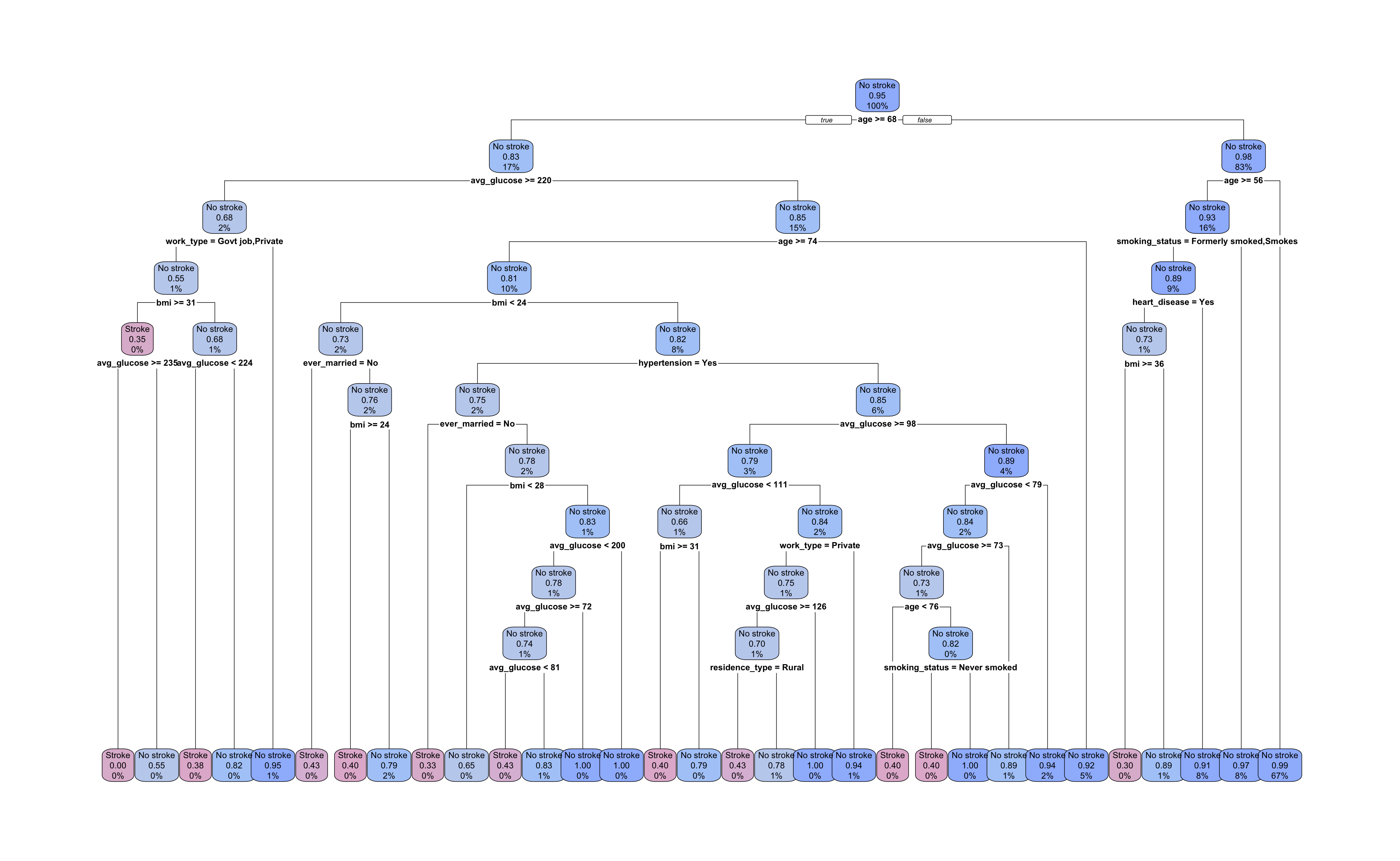
Our tree has grown to a depth of 10 splits with 31 terminal nodes. All nodes are labelled with the most prevalent outcome, the proportion of observations with the “Stroke” outcome, and the percent of all observations in that node. The root and each intermediate node show the predictor and cutpoint used to split the data.
Let’s take a look at the first few splits. The root node decision is \(age \ge 68\). Following the \(false\) right branch, the next node is also split by age with a cutpoint of 56 or greater. The right branch of this split leads to a terminal node and the left leads to a node split by smoking status.
With 30% of smoking status values missing, there is a good chance that some of these observations ended up in this node. From this plot, we cannot tell whether this is true and, if so, which surrogate predictor was used.
To find this information we can pipe the rpart object to summary() instead of rpart.plot(). In this way we can see the detailed decisions made at each node including a ranking of primary and surrogate decisions. The entire output is too long to display here but a chunk is provided.
stroke_fit %>%
  extract_fit_engine() %>%
  summary()
## Node number 6: 617 observations,    complexity param=0.005405405
##   predicted class=No stroke  expected loss=0.07455429  P(node) =0.1610125
##     class counts:    46   571
##    probabilities: 0.075 0.925
##   left son=12 (328 obs) right son=13 (289 obs)
##   Primary splits:
##       smoking_status    splits as  RLL,         improve=1.8571830, (117 missing)
##       avg_glucose_level < 110.86  to the right, improve=1.6386020, (0 missing)
##       heart_disease     splits as  RL,          improve=1.5747690, (0 missing)
##       bmi               < 35.4    to the right, improve=1.1504340, (29 missing)
##       gender            splits as  RL-,         improve=0.6356169, (0 missing)
##   Surrogate splits:
##       gender            splits as  RL-,         agree=0.564, adj=0.035, (117 split)
##       age               < 57.5    to the right, agree=0.562, adj=0.031, (0 split)
##       avg_glucose_level < 80.26   to the right, agree=0.556, adj=0.018, (0 split)
At node 6, we can see a primary split on smoking_status with 117 observations missing a value. The top ranked surrogate split is gender with the levels of “Female”, “Male”, and “Other” assigned right, left and neither, respectively. Neither for “Other” because none are present in this node.
Interestingly, the root node’s right branch accounts for 83% of training observations and produces only five of the 31 terminal nodes, one of which predicts occurrence of a stroke. The left root node branch produces a much more sprawling sub-tree and uses more varied predictors in its subsequent splits. Given the size of the tree and the initial values we selected for our hyperparameters, we should suspect overfitting.
We will prune the model by tuning the hyperparameters to which we previously assigned values that permitted a larger tree. Higher cost complexity will make it more expensive for the model to retain additional branches in the tree and a smaller maximum tree depth will stop the tree from growing too deep.
We could also tune the minimum number of observations per node to a larger value; however, to have a reasonable computing time, we will stick with tuning just two hyperarameters for this analysis. Together these hyperparameters can help us avoid overfitting while still maximizing performance.
We will assign tune(), which is a placeholder function for argument values to be tuned, to the cost_complexity and tree_depth hyperparameters, and let min_n take on the rpart default value of 20.
Here we also show that the engine and mode arguments can be equivalently specified within the decision tree model as opposed to using the set_* functions as we did before.
We then create a new workflow object by updating the model in the workflow specified above. The recipe will not change.
# Create a new model and add tuning hyperparameters
dc_tree_mod_tune <-
  decision_tree(
    cost_complexity = tune(),
    tree_depth = tune(),
    engine = "rpart",
    mode = "classification"
  )

# Create a new workflow by updating the model in the original workflow
stroke_wflow_tune <-
  stroke_wflow %>%
  update_model(dc_tree_mod_tune)
We will perform ten fold cross-validation tuning of our model to determine the set of hyperparameter values expected to result in the best performance on the test data.
First we create a data set of tuning values to test in our cross-validation using grid_regular(). We could have manually specified a data frame with pairs of values for cost complexity and tree depth but the advantage of grid_regular() is that it automatically generates an appropriate range of values for each specified hyperparameter.
The levels argument determines the number of values to be tested. If a single integer, levels will apply to all specified hyperparameters. Otherwise, a vector the same length as the number of hyperparameters is required. We will look at 5 values for both cost complexity and tree depth, thus 25 models in total.
The vfold_cv() function will produce the “folds” of data for our cross-validation. The v in the function name refers to the number of folds, the default for which is 10. As with initial_split() we can specify the strata argument so that random sampling is stratified by some variable.
# Create a data frame of tuning values to model
dc_tree_grid <- grid_regular(
  cost_complexity(),
  tree_depth(),
  levels = 5
)

# Set a seed and create cross validation folds
set.seed(234)
stroke_folds <- vfold_cv(stroke_train, strata = stroke)
This next part is a little to unpack, but we can do it!
To run the cross-validation tuning, we pass our tuning workflow object to tune_grid() which will compute performance metrics for each set of tuning hyperparameters by training the model on \(V - 1\) analysis folds and testing on the remaining assessment fold. Each fold acts as the assessment fold once, and mean performance metrics across the assessments are returned.
Which translates to a lot of computations; 250 in our case. Consequently, we might need more computing power than a standard sequential R process can provide (sequential meaning commands are executed in sequence).
tune_grid() can use the foreach package for parallel processing. However, we first have to make additional R processes available.
After determining the number of physical cores1 available with detectCores(), we use makePSOCKcluster() to create additional R processes identical to the main R process. To make these additional R processes available for use by the foreach package functions, we register them to the backend using registerDoParallel().
# Number of physical cores available
n_core <- detectCores(logical = FALSE)

# Create a cluster object and register as a backend
cl <- makePSOCKcluster(n_core - 1)
registerDoParallel(cl)
We can now run our cross-validation. This could take seconds to minutes depending on the computation and number of cores.
# Run the cross-validation tuning
stroke_cv <-
  stroke_wflow_tune %>%
  tune_grid(
    resamples = stroke_folds,
    grid = dc_tree_grid
  )
Once complete, stopCluster() tells the additional R processes to shut down, however they are still registered. It is good practice to un-register the additional processes by calling registerDoSEQ() which will reset to the sequential backend.
Many thanks to Precision Analytics’ Senior Software Developer, Hugo Barnaby, for his invaluable clarifications on parallel processing in R!
# Stop the cluster and reset with empty sequential backend
stopCluster(cl)
registerDoSEQ()
The stroke_cv data frame contains a list column, .metrics that stores the tuning results. We can see these results using the function collect_metrics().
stroke_cv %>%
  collect_metrics()
## # A tibble: 50 × 8
##    cost_complexity tree_depth .metric  .estimator  mean     n std_err .config
##              <dbl>      <int> <chr>    <chr>      <dbl> <int>   <dbl> <chr>
##  1    0.0000000001          1 accuracy binary     0.952    10 0.00306 Preprocessor1_Model01
##  2    0.0000000001          1 roc_auc  binary     0.5      10 0       Preprocessor1_Model01
##  3    0.0000000178          1 accuracy binary     0.952    10 0.00306 Preprocessor1_Model02
##  4    0.0000000178          1 roc_auc  binary     0.5      10 0       Preprocessor1_Model02
##  5    0.00000316            1 accuracy binary     0.952    10 0.00306 Preprocessor1_Model03
##  6    0.00000316            1 roc_auc  binary     0.5      10 0       Preprocessor1_Model03
##  7    0.000562              1 accuracy binary     0.952    10 0.00306 Preprocessor1_Model04
##  8    0.000562              1 roc_auc  binary     0.5      10 0       Preprocessor1_Model04
##  9    0.1                   1 accuracy binary     0.952    10 0.00306 Preprocessor1_Model05
## 10    0.1                   1 roc_auc  binary     0.5      10 0       Preprocessor1_Model05
## # … with 40 more rows
Trying to pull out the best set of values for cost complexity and tree depth according to both accuracy and ROC AUC (i.e. the area under the curve of the Receiver Operator Characteristic plot) is a bit difficult with just numbers, numbers, numbers to look at. So let’s get visual!
stroke_cv %>%
  collect_metrics() %>%
  mutate(tree_depth = factor(tree_depth)) %>%
  ggplot(aes(x = cost_complexity, y = mean, colour = tree_depth)) +
  geom_line(size = 1.3, alpha = 0.6) +
  geom_point(size = 1.5) +
  facet_wrap(~ .metric, nrow = 1) +
  scale_x_log10(
    breaks = unique(dc_tree_grid$cost_complexity),
    labels = formatC(unique(dc_tree_grid$cost_complexity), format = "e", digits = 2)
  ) +
  scale_color_manual(values = pa_pal(5)) +
  theme_minimal() +
  theme(legend.position = "bottom", panel.spacing = unit(1, "lines"))
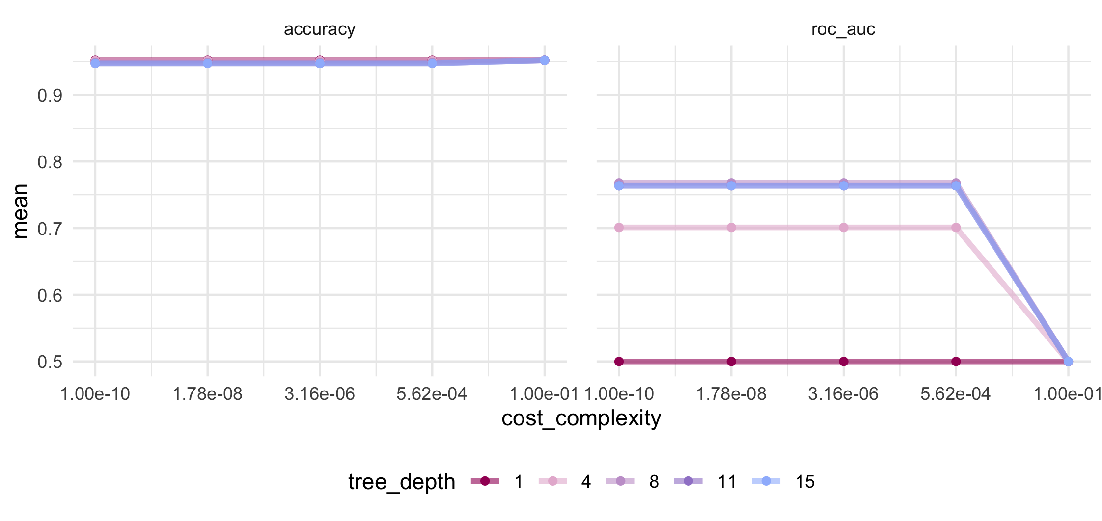
There are functions for displaying or selecting the “best” tuning values show_best() and select_best() which are entirely based on the estimated accuracy or the AUC values. We want to choose the set of hyperparameters to have smaller tree depth and higher cost complexity while maintaining a good performance.
Looking at the mean accuracy in the above plot shows no variation at all and will therefore be unhelpful in our decision making. Accuracy is a metric at risk of bias in the presence of a strong class imbalance so we will have to be careful how we interpret such a consistently high value.
We can see that mean AUC is maximized at tree depth of 8 and greater and for cost complexity values at or below 5.6 x 10⁻⁴. If we View() all the results from the above collect_metrics(), the 27th row will give us this set of hyperparameter tuning values. We can save this row and use it to update the hyperparameters in our workflow with the chosen values.
Instead of using update_model() as we did last time, we will use finalize_workflow(). This function is designed to take a tibble or list of tuning values for hyperparameters and splice them into the workflow object.
# Select best model
best_stroke_tune_val <-
  stroke_cv %>%
  collect_metrics() %>%
  slice(27)

# Splice in chosen hyperparameter tuning values
final_stroke_wflow <-
  stroke_wflow_tune %>%
  finalize_workflow(best_stroke_tune_val)
A handy function, last_fit(), both fits the final model on the training data and evaluates its performance on the test data in one shot.
We can use the metrics argument to specify which performance metrics we wish to see. Since accuracy was suspiciously high and constant during the tuning process, this time let’s select the AUC, sensitivity, and specificity.
# Fit the final model and predict the test data set
final_stroke_fit <-
  final_stroke_wflow %>%
  last_fit(stroke_split, metrics = metric_set(roc_auc, sens, spec))
Let’s take a look at the pruned tree. It now has a total of 21 terminal nodes with depth of 8 decision splits. Our pruning removed two layers of branches and ten terminal nodes from the tree.
# Visualize the final decision tree structure
final_stroke_fit %>%
  extract_fit_engine() %>%
  rpart.plot(
    roundint = FALSE,
    box.palette = pa_pal_2tone(6),
    yes.text = "true",
    no.text = "false",
    tweak = 1.25
  )
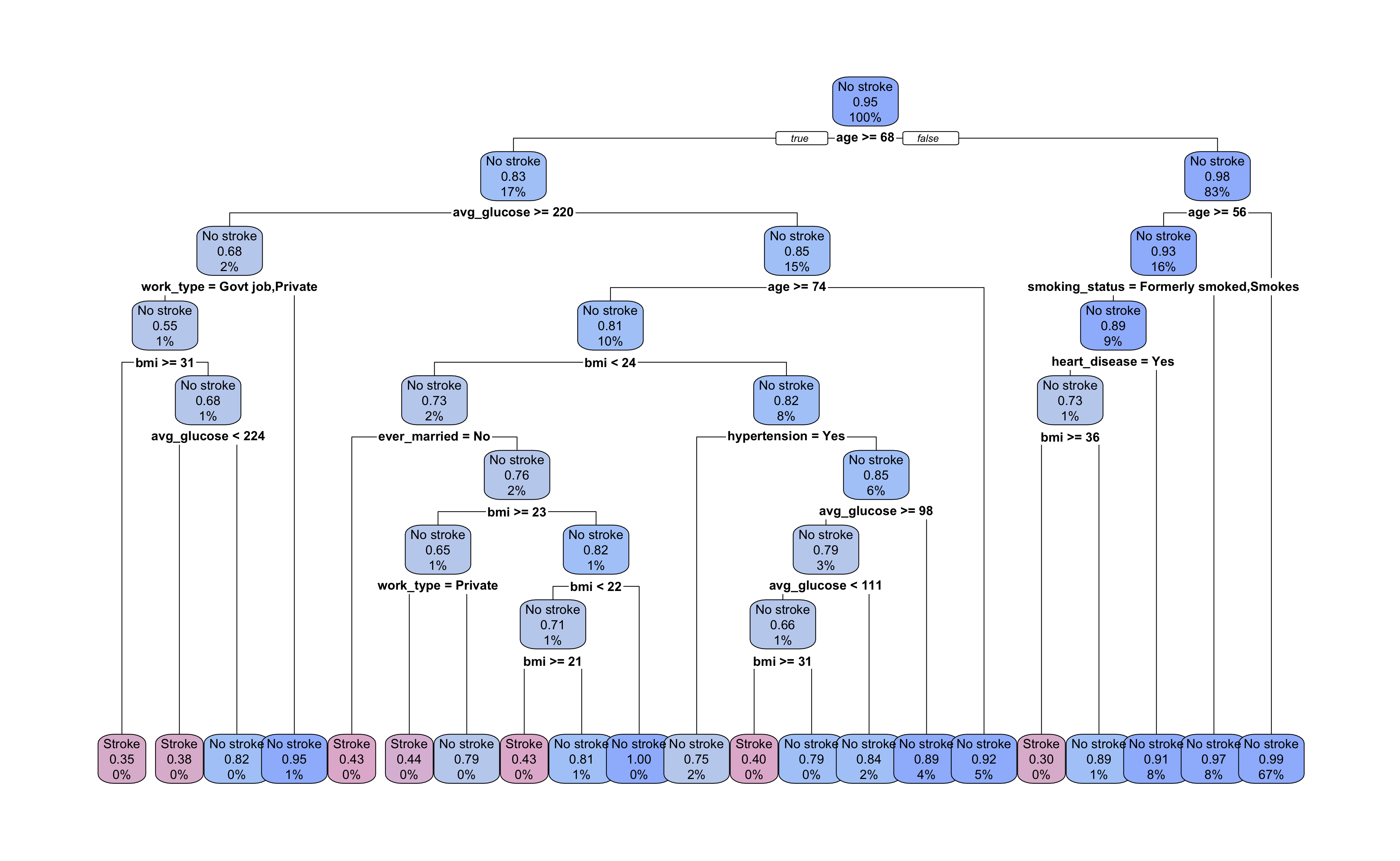
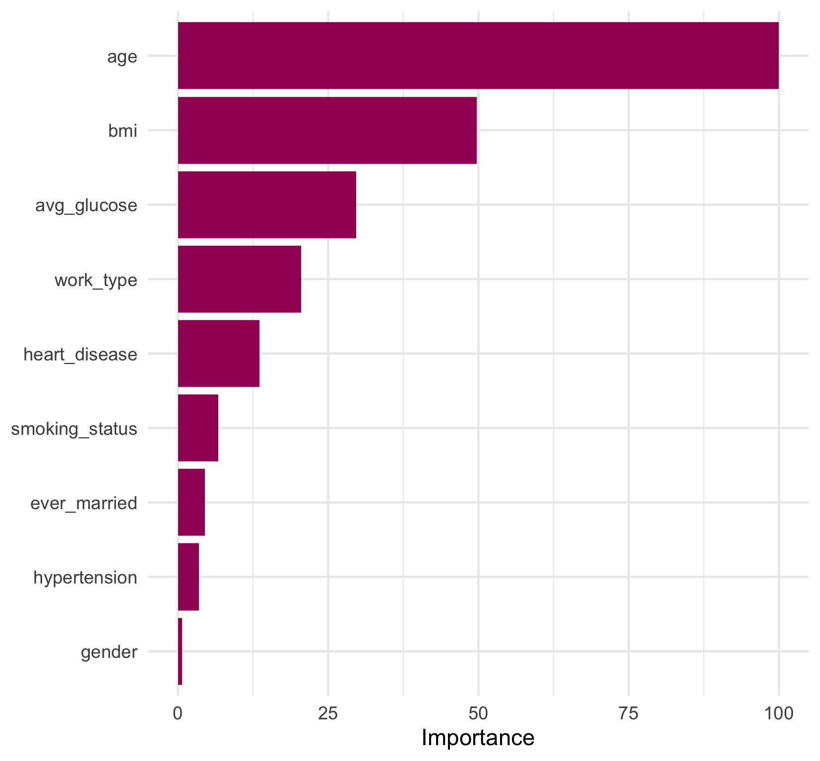
Looking at the decision splits, we can try to determine which predictors were the most important in the model. age and bmi appear most frequently in decision splits, but how do we quantify their contribution to the overall model? And how do we evaluate surrogate decision splits that aren’t displayed in the tree diagram?
The function vi() from the vip
package can calculate the variable importance for each predictor. From section 3.4 of the rpart vignette (PDF, 286 KB)
, the variable importance of an rpart model object is based on the sum of 1) the goodness of fit at each split in which a predictor was the primary variable and 2) the goodness of fit multiplied by the adjusted agreement for splits in which it served as a surrogate variable.
vi() can return either a value (default) or a rank (set rank = TRUE) for variable importance. A variable importance value is meant to be interpreted as the relative importance of variables in the model. Setting scale = TRUE will set the value of the most important variable to 100, and scale the importance values of the other variables relative to the most important.
final_stroke_fit %>%
  extract_fit_engine() %>%
  vi(scale = TRUE)
## # A tibble: 9 × 2
##   Variable       Importance
##   <chr>               <dbl>
## 1 age               100
## 2 bmi                49.7
## 3 avg_glucose        29.6
## 4 work_type          20.5
## 5 heart_disease      13.6
## 6 smoking_status      6.70
## 7 ever_married        4.49
## 8 hypertension        3.48
## 9 gender              0.649
We can see that age is the most important predictor in the model, which was fairly intuitive from the final tree diagram. However, now we know that bmi, as the second most important predictor, contributed half as much as age to the model’s overall goodness of fit. gender appears to have had a very weak contribution to the model as the lowest ranked contributor. And, interestingly, hypertension and smoking_status, which are both established risk factors for stroke
, also had a fairly small contribution to the model relative to age.
A convenient function, vip(), produces a plot of variable importance directly from the model fit object that can allow us to quickly visualize the relative importance. However, it is also simple (and fun!) to recreate this plot with one data transformation and a few lines of ggplot2 code. We’ve added some colour and a theme change to our plot to keep our visualizations consistent.
final_stroke_fit %>%
  extract_fit_engine() %>%
  vi(scale = TRUE, decreasing = FALSE) %>%
  mutate(Variable = factor(Variable, levels = Variable)) %>%
  ggplot(aes(x = Importance, y = Variable)) +
  geom_col(fill = pa_pal(1)) +
  theme_minimal() +
  theme(axis.title.y = element_blank())
To build an ROC curve, we can use collect_predictions() to extract the predicted probabilities, predicted class as well as the true outcome value from our last fit object. We can pass the truth (our outcome variable) and the predicted probability of having a stroke to roc_curve() and then to ggplot() to visualize the ROC curve.
The ROC curve shows us the trade off between sensitivity and specificity at different predicted probability thresholds. Our curve displays a fairly typical shape and indicates that our model performed better than chance at predicting the outcome (dotted line).
# View the ROC curve
final_stroke_fit %>%
  collect_predictions() %>%
  roc_curve(stroke, `.pred_Stroke`) %>%
  ggplot(aes(x = 1 - specificity, y = sensitivity)) +
  geom_line(colour = pa_pal(1), size = 1) +
  geom_abline(linetype = "dotted", size = 0.75) +
  coord_fixed() +
  theme_minimal()
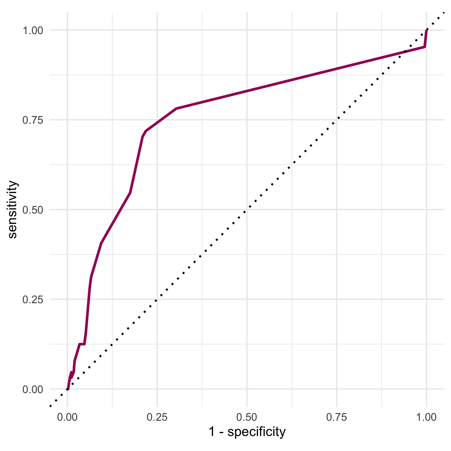
We can access the final performance metrics using collect_metrics() again. Our final model has an overall AUC of 75.3% but a sensitivity of only 7.8%, and a specificity of 98%. The large class imbalance in our outcome is one explanation for why we see such low sensitivity in this evaluation.
# Look at the performance metrics
final_stroke_fit %>%
  collect_metrics()
## # A tibble: 3 × 4
##   .metric .estimator .estimate .config
##   <chr>   <chr>          <dbl> <chr>
## 1 sens    binary        0.0781 Preprocessor1_Model1
## 2 spec    binary        0.980  Preprocessor1_Model1
## 3 roc_auc binary        0.753  Preprocessor1_Model1
The reported sensitivity and specificity are calculated based on the standard predicted probability threshold of 0.5. Since an AUC of 75.3% is not bad at all, we can use threshold_perf() on the predictions to examine the sensitivity and specificity values at different probability thresholds. The J-index (also known as Youden’s J statistic
) is another metric returned by threshold_perf() that can give clues about the trade off between sensitivity and specificity. It is simply calculated as \(sensitivity + specificity - 1\) and is meant to give equal weight to false positive and false negative predictions - i.e. overall misclassification.
Let’s use another plot to examine the results.
# Find the sensitivity, specificity and J-index values at different predicted
# probability thresholds
stroke_threshold <-
final_stroke_fit %>%
  collect_predictions() %>%
  threshold_perf(stroke, .pred_Stroke, seq(0, 0.5, by = 0.01)) %>%
  filter(.metric != "distance")

ggplot(stroke_threshold) +
  geom_rect(aes(xmin = 0.03, xmax = 0.08, ymin = -0.05, ymax = 1), fill = "grey80") +
  geom_line(aes(x = .threshold, y = .estimate, color = .metric),
    size = 1,
    alpha = 0.8
  ) +
  theme_minimal() +
  scale_colour_manual(values = pa_pal(3))
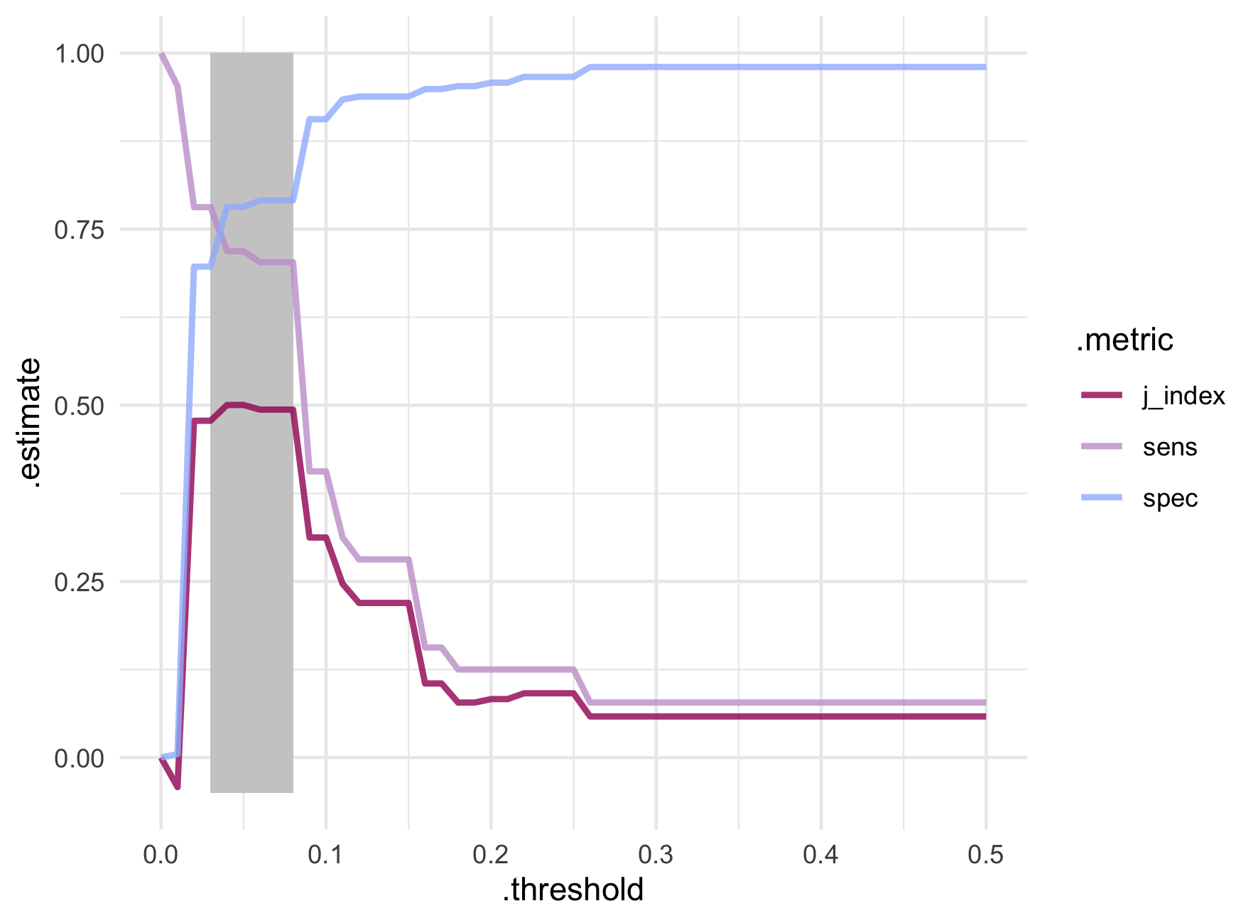
The best trade off between sensitivity and specificity appear between probability thresholds of 0.03 and 0.08. Extremely low values! While the J-index is technically maximized at probability thresholds of 0.04 and 0.05, it varies very little within the highlighted window. A big jump in sensitivity from 40.6% to 70.3% is seen around the threshold of 0.08 which also maintains a decent specificity of 79.1%.
stroke_threshold %>%
  filter(between(.threshold, 0.03, 0.09)) %>%
  pivot_wider(names_from = .metric, values_from = .estimate)
## # A tibble: 7 × 5
##   .threshold .estimator  sens  spec j_index
##        <dbl> <chr>      <dbl> <dbl>   <dbl>
## 1       0.03 binary     0.781 0.697   0.478
## 2       0.04 binary     0.719 0.782   0.500
## 3       0.05 binary     0.719 0.782   0.500
## 4       0.06 binary     0.703 0.791   0.494
## 5       0.07 binary     0.703 0.791   0.494
## 6       0.08 binary     0.703 0.791   0.494
## 7       0.09 binary     0.406 0.906   0.312
Maximizing the J-index can point to a useful threshold; however, as always, there is room for our own interpretation based on statistical and subject area knowledge. For example, in the context of assessing a patient for potential stroke, we might be willing to tolerate more false positives in an effort to ensure we correctly identify as many stroke events as possible. However, one could easily imagine another context where the consequences of false positives need to be taken into account (for example, if a false positive leads to unnecessary and invasive procedures that carry their own risks). These types of considerations underscore how important it is for data science teams to understand the implications of their decision making and to work closely with key stakeholders during model development.
Now we’ve successfully implemented a decision tree analysis using tidymodels! Even though the results might not have been optimal, we still learned a lot.
The final decision tree is straightforward and interpretable with respect to our predictors of interest. We can easily obtain a predicted outcome for a set of predictor values (i.e., patient characteristics) from this figure, without special tools or complex formulas. We also get a clear picture of the predictors used in the model and their role in predicting the outcome.
Decision tree analysis is especially useful in applications where stakeholders want to know how the model works, and whether associations between predictors and the outcome make sense (e.g., from a clinical or scientific point of view).
In our work, we know that the choice of analysis should depend on our client’s goals rather than strictly on the performance of each approach. While other approaches can achieve better prediction in some contexts, we still consider decision trees indispensable due to their ease of application and interpretation.
Decision trees suffer from some disadvantages, namely lower predictive accuracy than other machine learning models and instability to small changes in the training data. In efforts to offset these issues, methods for aggregating many decision trees together have been developed.
In our next adventure into tree modelling we’ll learn about some ensemble tree models, including random forest, as well as the steps for model comparison, all using tidymodels.
Find out more about our R training courses by contacting us at contact@precision-analytics.ca !
James, G., Witten, D., Hastie, T., & Tibshirani, R. (2013). An introduction to statistical learning: With applications in R. Springer Texts in Statistics. Springer Science+Business Media New York.
Kuhn, M., & Vaughan, D. (2021). Where does probably fit in? probably. Retrieved October 2021, from https://probably.tidymodels.org/articles/where-to-use.html
Kuhn, M., & Silge, J. (2021, October 21). Tidy modeling with R. Retrieved October 2021, from https://www.tmwr.org/ .
Milborrow, S. (2021, June 1). Plotting rpart trees with the rpart.plot package. Retrieved October 2021, from http://www.milbo.org/rpart-plot/prp.pdf .
RStudio. Get started. Tidymodels. Retrieved October 2021, from https://www.tidymodels.org/start/ .
Therneau, T., & Atkinson, E. (2018, April 11). An introduction to recursive partitioning using the RPART routines. The Comprehensive R Archive Network. Retrieved October 2021, from https://cran.r-project.org/web//packages/rpart/vignettes/longintro.pdf .
A small side note on the number of cores used for parallelization. Notice that we used
logical = FALSEwhen detecting the number of cores. This argument allows us to detect the number of physical cores as opposed to the number of hardware threads that can run concurrently on the physical cores (which is commonly greater than the number of physical cores on modern CPUs; see the Wikipedia entry on Multithreading for more details).When running more processes than cores, the benefits of parallelization are lost because the processes have to share the core to which they are assigned, meaning they will be intermittently paused and resumed.
Also note that we used one less than the total number of physical cores when creating the additional R processes to allow the remaining core for operations outside of R. ↩︎